If you aren’t using mobile friendly landing pages, you’re losing out on conversions and you’re wasting money. Here’s how to fix that.
Let’s get this straight: mobile landing pages and desktop landing pages are not and should not be the made same. If you aren’t using mobile friendly landing pages, you’re losing out on conversions and you’re wasting money.
You know, we know, everyone knows by now that you have to be on mobile because its a key platform that facilitates numerous touch points along the buyer journey. Google’s data tells us that mobile is the likeliest starting place for online activities, whether it be researching a product through reviews or comparing prices, that can ultimately culminate in a sale down the line. In the past, in the case that research that started on mobile ended in a conversion, that conversion would most commonly occur on desktop.
That’s not the case any more. The growth of mobile commerce is outpacing traditional e-commerce according to ComScore reports. A third of all online sales come from mobile devices now.

So for the sake of winning more conversions, getting more sales, and just plain making more money on mobile, this article breaks down exactly how to build the perfect mobile landing page.
1. Design with Speed in Mind

Mobile users demand instant and easy to digest information that cuts to the chase. They are fast and furious – any latency or slow load times make them agitated and immediately turns them off. Building landing pages for mobile users demands attention to user experience. That means quick load times, short forms, and catchy copy. Make sure you’re optimizing so that you have no slow-loading content.
In same cases, getting rid of images all together in favour of concise copy might work better. Page load times factor into strong user experience which contributes to higher conversion rates overall. Search engines also factor load times into their ranking process as well so keep in mind that slower mobile loading times can throw off your search results and ultimately effect your bottom line.
2. Keep Your Copy Short and Sweet Without Losing Clarity
Keeping your headlines concise is just general good practice. But on mobile, its even more important because of how easily distracted users are. Remember, mobile users are always multitasking and so their attention is already often divided. Don’t distract them further. Worst yet, don’t annoy them by making them have to read so much.
You know this first hand through your own mobile user behaviour. How often do you really read a full article through from A to Z? How often do you just briefly scan a page for the bare minimum info? Why do you think point form listicles are a thing now? Because we live in an age of short attention spans.
Thus, for mobile landing pages headlines should be as short and succinct as possible while all other copy should be minimized. The best way to practice writing clear and concise copy is by writing then editing, over and over and over again until you have the bare minimum that works.
3. Use Strong and Immediate CTAs or Click to Call
Keeping CTAs above-the-fold on mobile landing pages don’t always work, simple due to the variety of screen sizes out there. So the above-the-fold rule doesn’t necessarily always apply. That being said, you should still make sure your CTA is clearly visible and easily clickable by a user’s fingers (and also that it works).
Make sure you’re also optimize for smaller screen sizes. That means making your buttons fairly large. If click-to-call is applicable to your business, swap out your normal CTA for a clickable phone number instead.
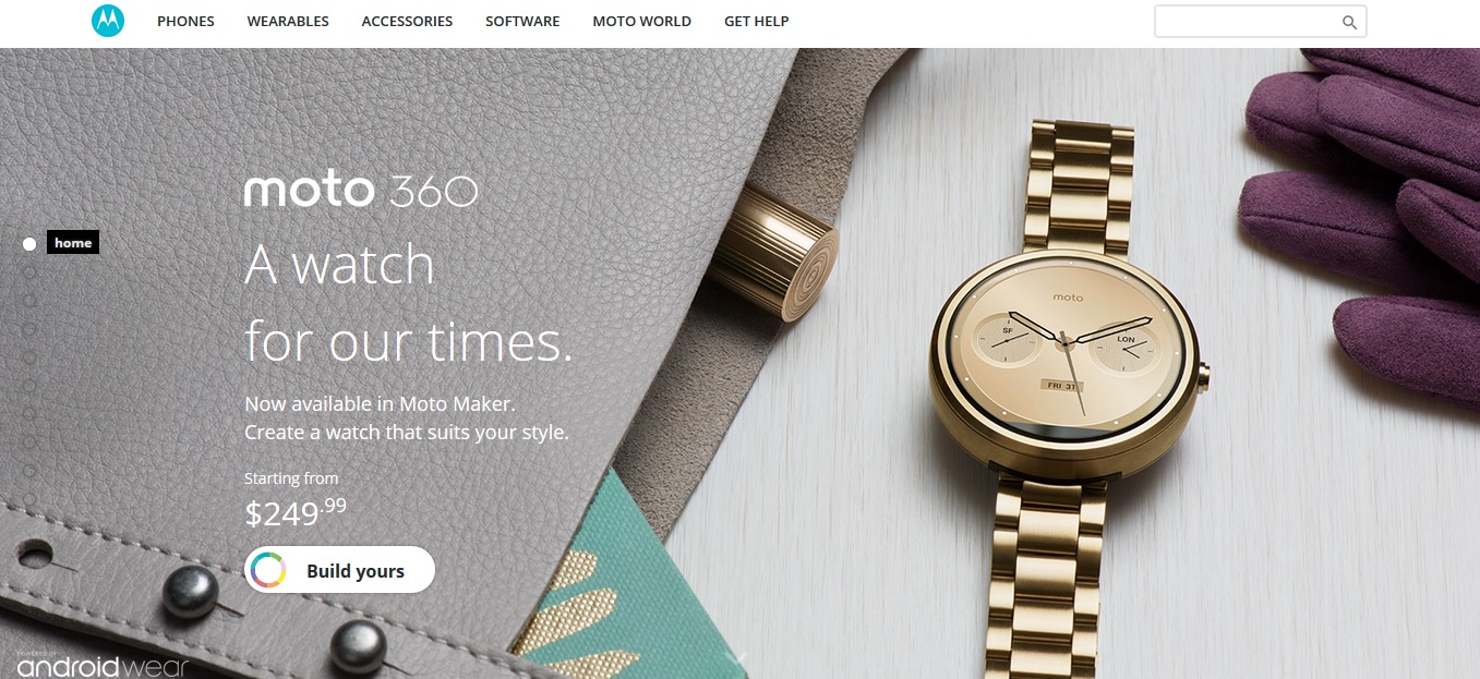
Look at the difference between this desktop landing page:

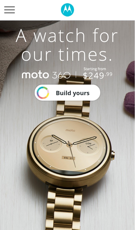
Here is the mobile version:

4. Keep Forms Short and Reduce Optional Fields as Much as Possible
We’ve mentioned already that mobile users are really distracted and easily agitated. So unlike on desktop where visitors may be willing to fill out long forms and provide additional information, mobile users are immediately turned off by too many forms.
The reasoning? Screen size. Forms are hard to fill out on small mobile screens what with our giant thumbs and these tiny little fields. Nobody has time for that! Even dropdown menus can be problematic on mobile as well. How often have you been frustrated by dropdown menus and millions of fields on a mobile landing page and just went “Urgh, forget this”? So then you know what I’m saying!
Our advice? Avoid them if you can so that you reduce the likelihood of visitor resistance.
Here’s an excellent reduction of form fields from desktop to mobile:

5. Avoid the One-Size-Fits-All Mentality
Don’t you just hate when you land on a mobile page and you have to pinch the screen to zoom in to see what the message is? Or an image loads and its so big, it doesn’t even fit on the page and then you get distracted about why you even came to the page… and before you know it, you’re out of there.
For the love of conversion, don’t treat your mobile landing pages like desktop. Make sure your designs are either a) responsive or b) adaptive.
A responsive landing page automatically resizes to fit any screen size. With responsive, no matter the device your audience is using they should be able to see your landing page seamlessly across screens which is a good thing because there are multiple user touch points in the buyer process on numerous devices. It’s important the responsive designs for landing pages are used to maintain strong user experience and drive conversion.
Here is an example of responsive landing pages from Skinny Ties.

Adaptive landing pages on the other hand are a little different in that the content of the landing page conforms or “adapts” to the screen size by displaying only the most relevant and important components. Adaptive landing pages are like the nutshell version of a desktop landing page or website.
Here is an example of an adaptive landing page:

Key Takeways
- Optimize your landing pages for fast load times
- Keep copy short and sweet (without sacrificing clarity)
- Use strong CTAs or Click-to-Calls
- Keep your forms short and minimize distractions
- One-size does not fit all landing pages
Keep these key takeaways in mind when you set out to start your next campaign. Build better landing pages and watch your conversions grow.
Want to learn more? Connect with our team at sales@clearpier.com